
Top 10 Favorite Fall Paint Colors
Top 10 Favorite Fall Paint Colors
As the leaves start to change color and the weather starts to cool down, it can only mean one thing: fall is officially here! One of the best things about fall is all of the beautiful colors. Here at Jordan Morrissey Interior Design, we're gearing up for all the warm tones and hues that people will use in their homes. Something about a fresh coat of paint really elevates a home. Even if you don't love the idea of painting an entire room, brushing the front door with some color will still make your home feel festive.
So, let's take a look at our top 10 favorite fall paint colors for 2022. From rich oranges to calming blues, we have a color for everyone!
*Note: We're not affiliated with any of these brands; we just love them enough to recommend them.*
10 Go-To Fall Paint Colors for 2022
Fall Reds

Heritage Red by Benjamin Moore - HC-181
Red is always a bold choice, no matter the time of year. But during the fall and winter months, it’s certainly a favorite, especially when you’re going for cheerful energy. Heritage Red by Benjamin Moore is our favorite red hue this year. It’s rich, bold, and about as classic as your favorite lipstick. As part of the Heritage collection, this red color will certainly add a lot of personality to a room. With magenta undertones, you’ll either get a bright red by day or a deep, bold red by night.

Cut Ruby by Valspar - 1009-4
Is there anything better than curling up in front of the fireplace with a glass of red wine? We didn’t think so! As the weather cools down, we know many of you will be taking advantage. This includes looking for the perfect island or bathroom paint color, and we’ve found it in Cut Ruby by Valspar. Soft and elegant, this warm red reminds us of some of the red blends we like to sip on after a long day at the office. It’s comforting and inviting, adding richness to any area of your home.
Beautiful Yellows

Autumn Gold by Benjamine Moore - 2152-30
We think the name Autumn Gold from Benjamin Moore speaks for itself. This deep gold hue is distinct and perfectly captures the right tapestry of fall. It’s great as an accent wall or even for the front door. Right up the middle, Autumn Gold pairs nicely with cream colors, softer greens, and even a warm cognac. You really can’t go wrong with something like this, especially for the fall, especially if you like a range of gold hues throughout the day, depending on the sunlight.

Kingdom Gold by Sherwin Williams - SW6698
If you’re like us, you love the changing of the seasons. There’s something about a fresh start and a different time of year that gets us excited. We love looking for ways to bring the fall indoors, which is probably why we love Sherwin Williams’ Kingdom Gold. Mustard hues are always a popular choice, especially for fall. So, this paint color is perfect. It’s a rich gold color that goes great with all your whites, greys, and even navy throw pillows. So, if you’re wanting to add some pop of fall color that makes you happy, then this is your go-to!
Spicy Oranges

Fireside Chat by Valspar - 8002-15G
If we had to choose just one color to represent fall, Fireside Chat by Valspar just might be it. The perfect warm orange with some red undertones, this paint color ideally is perfect all year round. It’s warming, comforting, and easy on the eyes, no matter the time of day. It’ll make those fall decorations and pumpkins pop but won’t clash with your reds or yellows. It’s probably the most ideal fall color out there right now, tying all the hues of fall into one color swatch.

Jalapeño by Sherwin Williams - SW6699
Fall really makes us think about rich, deep red tones, especially in paint colors. And we think Jalapeño by Sherwin Williams is to die for! This rich, rustic color doesn’t just mimic that changing of leaves on every tree; it also reminds us of warmth and comfort. While the name might be spicy, this paint color adds so much charm and character to living rooms, bathrooms, and even kitchens. During the day, you’ll be graced with a lighter hue with orange undertones, and in the evening, you’ll get that deeper red that matches the embers in the fireplace.
Feel-Good Greens

Tuscany Hillside by BEHR - PPU10-02
Just because autumn is here doesn’t mean you have to let go of everything green. In fact, Tuscany Hillside by BEHR is a great example of how your home can still hang onto warmer weather while transitioning into a new season. This color is ideal as an accent wall in the living room or even as the color for the front door. The light green with yellow undertones is sure to bring life, and a little bit of sunshiny feels to any room. Depending on the light source and the room, you could see the dark side or lighter side of this paint color.

Deep Spruce by KILZ® - RG290-02
If you’ve been around for a while, then you know we LOVE a deep green. We love these shades in bathrooms, living rooms, and especially in the kitchen as the color of cabinetry. So, if you’re trying to mimic a Jordan Morrissey look and feel, then you can’t go wrong with Deep Spruce from KILZ®. This paint color is deep with some yellow undertones, which means it catches the light just right. Depending on the light source and time of day, it’ll even give you that deep green Christmas tree feel – Making it the PERFECT shade to keep through the entire winter!
Moody Blue-Greys
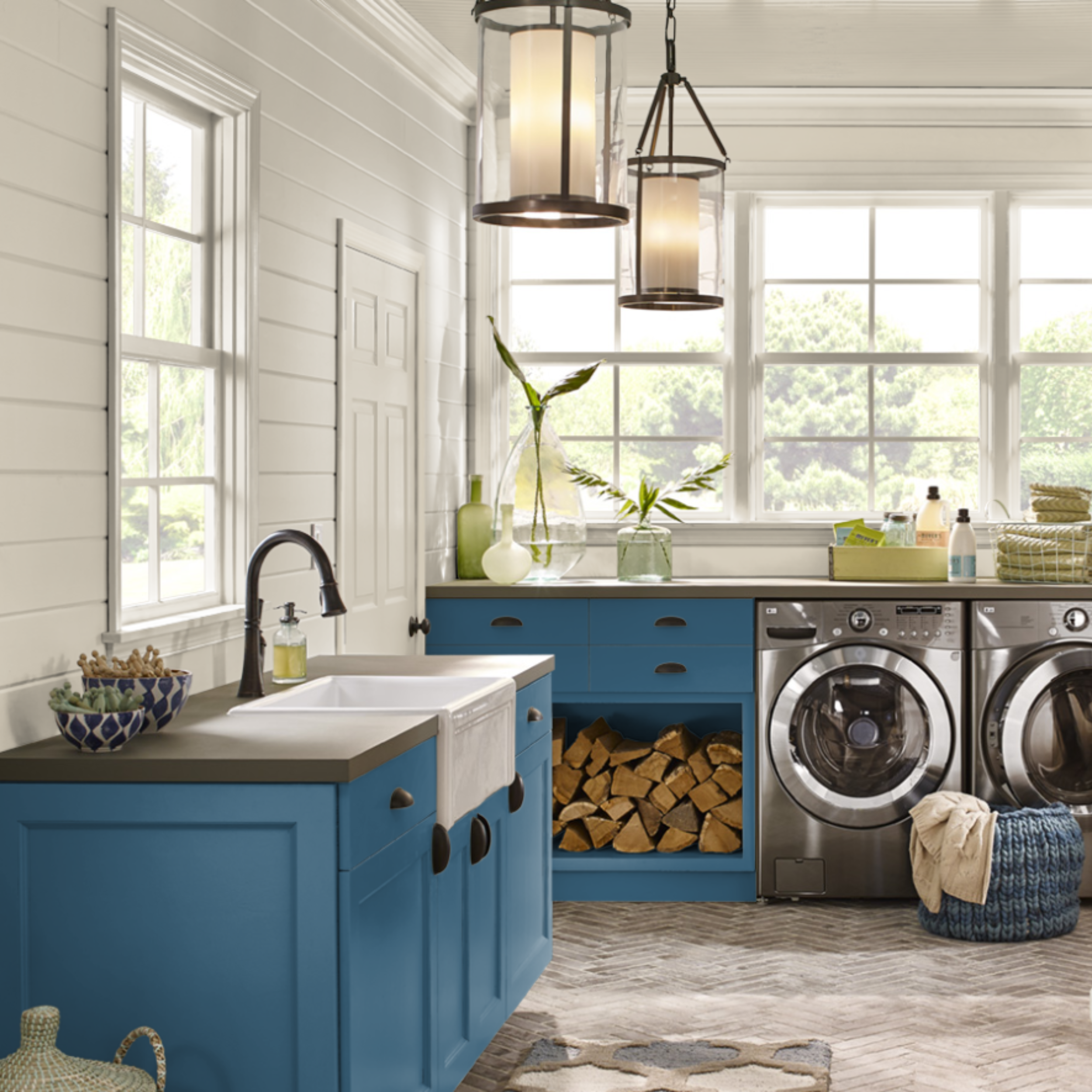
Shasta Lake by BEHR M490-7
If you love the idea of getting ready for fall but hate the idea of painting an entire room one color, then try just painting the cabinets or accessories with Shasta Lake by BEHR. This gorgeous blue/grey hue highlights these features in any room without overpowering the entire space. This fall accent color is great in any room, no matter the light source or time of day. Its calming effects will quickly turn your frown upside down.

Porpoise Grey by KILZ® RM110
Don’t be afraid to mix a little grey with your blue. Porpoise Grey by KILZ® is a beautiful medium grey with just the right amount of blue undertone. It won’t overpower a room, but it certainly will give it a mood. Depending on where you want to use this paint and the light source, you might find it appears to be a more fog grey, so placement with this color is huge. If you want more of the blues, use the paint where there’s not a lot of direct light. But if you love the idea of a foggier grey that appears blueish at night, then splatter this where ever you’d like.
Get Ready for Fall!
Love these paint colors and suggestions? Then make sure you follow us and share this blog with your friends. We are working on some exciting new projects, including an Etsy shop where you’ll be able to find all of our favorite things, including paint color schemes.
If you want to work with Jordan Morrissey Interior Design, follow us on social media or get in touch with us today! Let’s look ahead at creating your own unique spaces that feel like home.